

Summary
Students will investigate the episode rating data for the "American Idol" TV series as they learn how to describe scatter plots using academic language. Students will create and analyze scatter plots, considering how one could use scatter plots to make decisions. Sketching a trend line (or line of fit) by hand is a prerequisite for this lesson.
Essential Question(s)
How can we use scatter plots to make decisions?
Snapshot
Engage
Students make observations about a given scatter plot and consider how one could use the graph to make decisions.
Explore
Students examine the scatter plot more closely and attempt to describe the trend.
Explain
Students solidify their vocabulary for describing trends in scatter plots and consider how an outlier may impact their description.
Extend
Pairs create and describe scatter plots, with trend lines, for the individual seasons of American Idol and then for the overall TV series.
Evaluate
Students create a scatter plot based on a given description.
Materials
Guided Notes handout (attached; one per student; print two-sided)
The Data handout (attached; one per pair; print one-sided)
The Graphs handout (attached; one per pair; print one-sided)
The Graphs (Key) document (attached)
The Final Judgement handout (attached; one per pair; print one-sided)
String or Yarn (class size will determine length; see Extend below)
Coloring utensils (optional)
Clear tape
Marker (one)
Student devices with internet access
Engage
10 Minute(s)
Provide students with your session code. Then, have them go to student.amplify.com/join and enter the session code.
Introduce the lesson using screens 1–2 of the Desmos Classroom activity. Screen 1 displays the lesson's essential question. Screen 2 identifies the lesson's learning objective. Review each of these with students to the extent you feel necessary.
Since this lesson is themed around a competition show, consider playing the role of “host” and reading through the activity directions in an overly dramatic way.
Direct students’ attention to screen 3 and share with students that during this lesson they are going to analyze data from the TV series American Idol. Consider reading the information on this screen aloud or have students read it to themselves so that everyone in the class has a little background knowledge of the show.
Have students select the “Next” button and navigate to screen 4. Here, they assume the role of data analysts to make observations about the given data. The given data is a scatter plot where x represents the episode number and y represents the average episode rating from the first three seasons of American Idol. Again, consider reading the text on the screen and describing the axes aloud. However, do not describe any trends in the scatter plot at this time, as students will be investigating that further later in the lesson.
Then direct students to navigate through screens 5–6, where they can see the scatter plot of the three seasons of data in more detail, and use the I Notice, I Wonder strategy to answer questions about the graph. Once students select the “Submit” button on screen 6, they are asked, “How do you think you could use a scatter plot to make decisions?”
As you notice most students are completing screen 6, ask for a few volunteers to share what they noticed, then ask for a few volunteers to share what they wonder. If time allows, ask for volunteers to share how they believe they could use a scatter plot to make decisions. Use the shared responses and responses from the Dashboard as a formative assessment to see what prior knowledge students have about scatter plots. Make note of any misconceptions, but wait to correct them until the Explain phase of the lesson.
Explore
15 Minute(s)
Instruct students to find a partner or assign partners. On the Dashboard, press the orange plus sign five times to allow students to progress to screens 7–11.
Direct pairs to read the information and answer the question on each screen. Each screen gives feedback based on the selected response, so this is a great time to circulate the room and answer questions. During this portion of the lesson, students are informally introduced to the ideas of direction, form, strength, and outliers as ways to describe or analyze scatter plots.
On screen 11, students are asked to consider how their description might change if the outliers were removed. As you notice most students completing this screen, bring the class together for a brief discussion about the impact of removing outliers and how that impact could be anywhere from a lot to none, depending on the set of data.
Explain
20 Minute(s)
Press the orange plus sign on the Dashboard once to allow students to progress to screen 12. As students order the graphs from having the strongest to weakest association, distribute a copy of the attached Guided Notes handout to each student.
On the Dashboard, press the orange plus sign once to allow students to progress to screen 13. Use this screen to guide students in understanding that the first step in describing scatter plots is identifying direction. Students should determine whether there is a positive, negative, or no association between x and y. Encourage students to add notes to the front side of their handout. Consider giving students coloring utensils, as these notes were designed for students to engage with.
Press the orange plus sign on the Dashboard once to allow students to progress to screen 14. Use this screen to help students understand that once they have determined that there is an association, the next detail to determine is the form. They need to decide if the trend is linear or nonlinear.
On the Dashboard, press the orange plus sign once to allow students to progress to screen 15. Use this screen to help students understand that after they know whether the association is linear or nonlinear, they need to determine the strength. They need to decide if the association is strong, moderate, or weak.
Press the orange plus sign on the Dashboard once to allow students to progress to screen 16. Use this screen to help students understand that outliers are those points that do not seem to fit the pattern of the rest of the data.
On the Dashboard, press the orange plus sign once to allow students to progress to screen 17. Direct students’ attention to the back of their handout and introduce them to “Contestant #1” (the first example). Ask students guiding questions, but have them describe the first scatter plot using what they have learned. Students can type in their response for feedback in Desmos or just take notes on their handout; either is fine, but clearly communicate with students your expectations.
Press the orange plus sign on the Dashboard twice to allow students to progress to screens 18–19. Have students use the Desmos Classroom activity to complete their notes. Here, students should type their response, use the sketch tool to circle the outlier, and then get feedback about the correct description for each scatter plot (contestant).
Once finished, have students add this handout to their math notebook if that is a classroom norm.
Extend
40 Minute(s)
On the Dashboard, press the orange plus sign once to allow students to progress to screen 20. This screen gives a brief overview of the activity and indicates that students are to set aside their Desmos Classroom activity to complete the following activity.
Have students find a new partner or continue working with their partner from before. Give each pair one page from the attached The Data handout and the corresponding page from the attached The Graphs handout. Direct pairs to follow the directions on the handout and use the given data to create a scatter plot.
As pairs are finishing their scatter plots, give each pair a copy of the attached The Final Judgment handout. Here, students are asked to describe their scatter plot and then three other scatter plots. Pairs who finish early can go ahead and describe their own. Once everyone has finished their scatter plots, have students make their scatter plots easily visible on their desks (possibly clearing their desks of other things) and have students visit other desks to describe three other scatter plots. Students are also asked to make a decision about each season. Should the network renew the show? Why or why not?
After approximately 5 minutes or when students are finished, have them return to their scatter plots. Give each pair a ruler and have them sketch a line of fit.
As time allows, ask for volunteers to share their descriptions for a selected season with the class. Use the attached The Graphs (Key) document as needed.
When students are done, have them fold their paper along the left vertical dashed line (there are two of these lines) such that their y-axis is now behind their scatter plot. Then direct the pair with Season 2 to align their fold with the vertical line of Season 1 and tape the seasons together. Have pairs repeat this until all of the seasons are connected and the graph is easily visible to the class (i.e., hung on the wall).
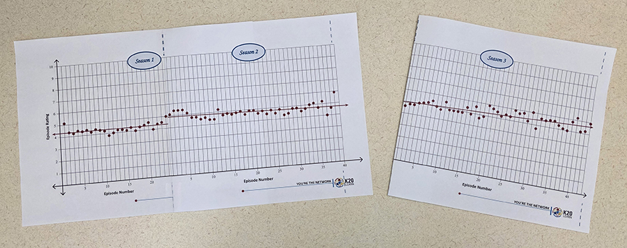
Now have two students hold the ends of the string and have the class help determine how they should hold the string to represent the best-fit line. Once the class is satisfied with the placement of the string, use a marker to draw the trend line across the pages.
Then ask the class, “How could a network use these scatter plots to make decisions? And what decision(s) would you make?” As volunteers share, encourage them to use the academic language they learned during this lesson.
Evaluate
5 Minute(s)
On the Dashboard, click the orange "Stop" button; this allows students to complete the rest of the Desmos activity at their own pace.
Have students return to their Desmos Classroom activity and direct their attention to screen 21. Here, students are given a description and are asked to create a scatter plot that matches the description. Direct students to drag the points from the origin to represent the data from the first nine episodes of the new show, Beat the Beat, to have a positive, linear, and strong trend without any outliers.
Resources
K20 Center. (n.d.). Desmos classroom. Tech Tools. https://learn.k20center.ou.edu/tech-tool/1081
K20 Center. (n.d.). I notice, I wonder. Strategies. https://learn.k20center.ou.edu/strategy/180
RatinGraph. (1970, January 1). American Idol ratings (TV show, 2002-). Episodes average rating. https://www.ratingraph.com/tv-shows/american-idol-ratings-14588/
American Idol. (2002). American Idol [Logo]. Wikimedia Commons. https://commons.wikimedia.org/wiki/File:American_Idol_logo.svg