

Summary
In this lesson, students make connections between prior knowledge and new knowledge of mathematical concepts. Students label dot plots and box and whisker plots, identify minimum, maximum, and median data points, and create box and whisker plots. This lesson encourages students to create their own questions about box and whisker plots.
Essential Question(s)
How and for what types of data might a box and whisker plot be useful when displaying data? What data points are unclear when using a box and whisker plot?
Snapshot
Engage
Students use their birthdays and a number line to construct a human dot plot then discuss other ways they could display their data from the dot plot.
Explore
Students learn how to transform their dot plot into a new type of graph by applying their knowledge of dot plots, minimum value, maximum value, and median. Students explore the fundamentals of box and whisker plots by creating a human box and whisker plot, and then draw and label their plot in their notebooks.
Explain
Students explain how data is dispersed in a box and whisker plot and describe how to construct box and whisker plots from a set of data.
Extend
Students construct their own box and whisker plots from different data sources.
Evaluate
Students reflect on and detail the key components of a box and whisker plot. They also describe how data is displayed in quartiles and what information can be easily gathered from a box and whisker plot.
Materials
Lesson Slides (attached)
Box and Whisker Plot Flags document (attached; one set per teacher)
Explaining Box and Whisker Plots handout (attached; one per student)
Graph the Data handout (attached; one per student)
Data Sets (attached; optional)
Bubble wrap or butcher paper
Yarn
Sticky notes
Rulers
Colored pencils or markers
Preparation
Prior to the Engage section of the lesson, set up the following:
Number 31 sticky notes with numbers 1–31, one number per sticky note.
Evenly space the sticky notes on the floor along one side of your classroom. If space is not available in your classroom, consider using a hallway or another open space.
Print and cut out the Box and Whisker Plot Flags to mark the separate sections of the box and whisker plot.
Use bubble wrap or butcher paper to serve as the “box” and yarn to serve as your “whiskers”.
Engage
5 Minute(s)
Use the attached Lesson Slides and introduce the lesson using slide 2. Display slides 3–4 and introduce the essential questions and lesson objectives.
Display slide 5 and ask students to recall their birthday. Have students find the sticky note along the wall that corresponds to the day of the month on which they were born (1–31). Remind students to use only the day, not the month or the year.
If multiple students are born on the same day, have them line up behind the same number in order of oldest to youngest. As students line up, ensure that each person has found a space on the number line.
Introduce statistical reasoning by telling students that by lining up in front of the number line, they created something called a dot plot in statistics.
Display slide 6. While students are still lined up in a dot plot, introduce the Elbow Partners instructional strategy. Have students find an Elbow Partner and discuss the following questions:
1. What do you notice about our dot plot?
2. What other ways could we display our birthday data?
Explore
15 Minute(s)
Share with students that they should work together to construct a box and whiskers plot using statistical terminology. Tell them that they must work together as a whole class, but you will guide them.
Display slide 7 and use the questions on the slide to guide students in labeling points on their dot plot. Ask students to determine the minimum and maximum values for their dot plots. Give the student(s) standing on the maximum and minimum values a flag to mark these.
Ask students to determine the median value of the dot plot, and ask how they would find this value. Mark the median value with another flag.
Ask students to consider how they would find the four quartiles now that they know the median. Students may be unfamiliar with the term quartile. Consider guiding them to determine the definition of the word using logical inferences based on the root of the word, quart.
If students struggle to define all four quartiles, guide them to determine these values. After identifying the median of the whole data set, redefine this value as the maximum of the lower half of the data set. Guide students to find the median of the lower half. This creates quartile 1 (Q1) and quartile 2 (Q2). Then, use the median as the minimum of the upper half of the data set. Determine the median of the upper half. This creates quartile 3 (Q3) and quartile 4 (Q4).
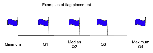
Mark the maximum of Q1 and Q3 with flags. You should now have five marked data points:
Minimum
Lower quartile (Q1)
Median (Q2)
Upper quartile (Q3)
Maximum (Q4)
Refer to the diagram below for an example of what your flag placement should look like.
Use the bubble wrap, or butcher paper, and the yarn to complete your human box and whisker plot. Have the students standing at Q1 hold one end of the bubble wrap or butcher paper, and have student standing at Q3 hold the other end. The bubble wrap or butcher paper defines the distance between Q1 and Q3.
Give students at Q3 one end of one piece of the yarn, and give students at the maximum the other end. Give students at Q1 another piece of yarn, and give the other end of that piece to students standing at the minimum.
Ask students not holding materials to take their seats. Have these students draw the human box and whisker plot and describe what they see in their notebooks.
Explain
25 Minute(s)
Show slide 8. Have students return to their desks and pass out the attached Explaining Box and Whisker Plots handout.
Ask students to work with a partner to share their observations about the box and whisker plot they created as a class. Have them identify and define the terms on the handout: quartiles, median, maximum, minimum, box, and whiskers. Allow students approximately five minutes then discuss the definitions students created. Correct any misconceptions.
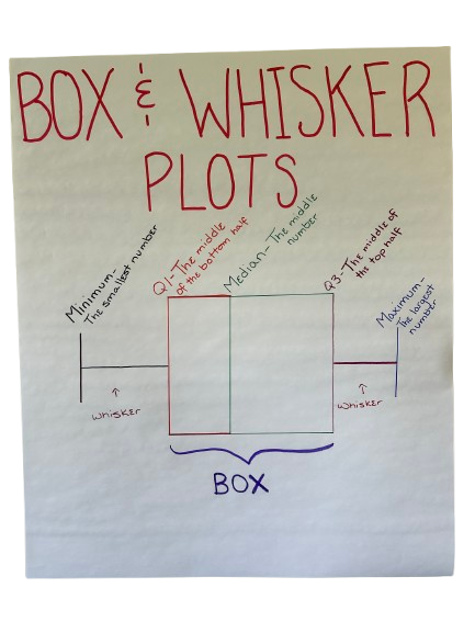
Show slide 9. Pass out poster paper and markers to each pair of students. Tell students that they will be making an Anchor Chart for box and whisker plots. Have students draw a box and whisker plot on their poster and label the following parts: minimum, Q1, median, Q3, maximum, box, and whiskers. Have them write the definitions of each term either on the word itself or in a list somewhere on the poster. See the image below for an example of an Anchor Chart.
Display slide 10. Have students navigate to the GeoGebra activity, Box and Whisker Plot Practice. Allow them to work with a partner to create box and whisker plots. Encourage them to use the Anchor Charts around the room to assist them with the activity.
Extend
30 Minute(s)
Display slide 11 and pass out the Graph the Data handout to each student. The handout directs students to generate a data set or use a set given to them. Clarify these directions depending on your chosen data sets.
Show slide 12. Pass out a blank piece of paper to each student. Explain to students that they will be creating a One-Pager about box and whisker plots. Explain that their One-Pager should have the following things:
A border that represents their data (e.g., baseballs and ball caps if their data is about homerun percentages)
A box and whisker plot of their data labeled with the minimum, maximum, Q1, Q3, and median
One complete sentence summarizing what they learned from the lesson.
Provide students with different materials to create their One-Pager, such as crayons, markers, magazines, or old newspapers. Allow 15–20 minutes for the activity.
Evaluate
15 Minute(s)
Transition to slide 13. Have students hang their completed One-Pagers on the wall around the room. Introduce students to the Gallery Walk instructional strategy. Distribute three sticky notes to each students and have them write their names on the back of each note. Have students walk around the room and view each other’s work. After they read another student’s One-Pager, have them write a question on a sticky note and stick the note to the paper. Have them repeat the process for each One-Pager they read.
Display slide 14. Pass out sticky notes or scrap paper and have students complete the How Am I Feeling? What Am I Thinking? questions as an Exit Ticket.
Resources
K20 Center. (n.d.). Anchor charts. Strategies. https://learn.k20center.ou.edu/strategy/58
K20 Center. (n.d.). Bell ringers and exit tickets. Strategies. https://learn.k20center.ou.edu/strategy/125
K20 Center. (n.d.). Elbow partners. Strategies. https://learn.k20center.ou.edu/strategy/116
K20 Center. (n.d.). Gallery walk/carousel. Strategies. https://learn.k20center.ou.edu/strategy/118
K20 Center. (n.d.).How am I feeling? What am I thinking?. Strategies. https://learn.k20center.ou.edu/strategy/187
K20 Center. (n.d.). One-pager. Strategies. https://learn.k20center.ou.edu/strategy/72
K20 Center. (2019). Human box plot data sets [Data set]. Google Sheets. https://docs.google.com/spreadsheets/d/1Q_-l4gzXR4rOHq712WS6jrSo2vxZJ1MJVeYHnTaSv6I/edit#gid=0